Every B2B SaaS company knows the importance of a high-converting landing page in their marketing toolset. These standalone web pages serve as the gateway to generating leads, converting potential customers, and ultimately driving revenue. But what separates a good landing page from a great one? In this blog post, we’ll unveil over 25 high-converting B2B SaaS landing page examples from industry giants like Intercom, HubSpot, and Salesforce, and share effective strategies to create your own high-converting landing pages for 2023.
Key Takeaways
- B2B SaaS landing pages are designed to convert visitors into leads or customers through visuals, CTAs, unique value propositions and social proof.
- Effective B2B SaaS landing pages prioritize user experience, emphasize benefits & features and embed social proof & testimonials.
- 25+ high converting examples provide insight on best practices for creating successful B2B SaaS Landing Pages in 2023.
Defining B2B SaaS Landing Pages
Specifically for software-as-a-service companies, B2B SaaS landing pages are web pages designed to convert visitors into leads or customers. I’m going to review some good landing page examples below from companies like Intercom, HubSpot, and Salesforce. These landing pages excel in combining compelling visuals, copy, a unique value proposition, tangible benefits backed by features, social proof and a clear call to action to create an effective, high-converting landing page.
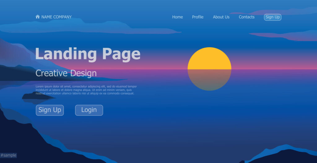
Effective use of white space can guide attention towards specific elements like a CTA button on a high-performing landing page. A distinguishable and powerful CTA that boosts conversions is vital for a high-converting landing page. Highlighting a strong offer from a product or service, such as a free account, is an effective way to motivate potential customers to take action on a B2B landing page.
Importance for SaaS Companies
SaaS companies rely heavily on B2B SaaS landing pages for their growth and success. They provide an opportunity for companies to showcase their products, generate leads, and drive conversions in the competitive B2B market. A persuasive headline, for example, can persuade visitors to explore further and learn more about the SaaS product or service offered.
A SaaS company landing page should do an effective job of helping prospects understand what the software does and why they should care about it. Focus on positioning the solution as an answer to your target market’s top problem and that should guide them down the page as they learn more about the value they can receive if they invest in your software.
Key Components
A concise value proposition, captivating visuals, a strong call-to-action, and social proof are fundamental elements of B2B SaaS landing pages. Offering free resources can also be an effective strategy to engage visitors. Having a distinct value proposition facilitates the efficient communication of the advantages of your product or service to the customer, making it easier to land new paying customers.
Images, videos, and animations have been known to capture and maintain user engagement, contributing to a good landing page experience. A strong call-to-action encourages the user to take action, while social proof serves to increase credibility and reduce resistance to conversion, ultimately contributing to effective lead generation.
Here’s an example of using a short repeating video (GIF) to demonstrate the capabilities of my product called Shorts Maker.

Effective Strategies for B2B SaaS Landing Pages
Combining various strategies like prioritizing user experience, emphasizing benefits and features, and embedding social proof and testimonials is key to developing an effective B2B SaaS landing page. By employing these strategies, companies have successfully crafted high-converting landing pages.
Emphasizing user experience is critical as it enables marketers to gain insight into the needs of visitors and provide answers to their questions before they are asked. This approach can be seen on the landing page for my own B2B SaaS product Podcast Show Notes, which focuses on providing a seamless user experience.

Showcasing benefits and features is vital as it allows marketers to underscore the value of their product, thereby simplifying the decision-making process for visitors. Leveraging social proof and testimonials is significant as it enables marketers to demonstrate to prospective customers that their product is reliable and utilized by other customers.
Pro Tip: It’s a common misconception that people make decisions based on logic. In reality, it’s typically emotion that initially causes them to take action. My car broke down once in 3 years – “What a piece of junk?!? I NEED another one NOW.” If you are aware of this pattern, you can incorporate it into your strategy for creating an effective landing page that converts for your B2B SaaS. The best advice I have here to generate results is to ensure you incorporate the emotional component to the experience and in particular the pain caused by the problem your product solves.
Focusing on User Experience
Prioritizing the user experience is crucial for creating a high-converting landing page. A landing page that is easy to navigate, visually appealing, and mobile-responsive provides a seamless experience for users across all devices. By offering an engaging experience, a landing page will be better equipped to persuade visitors to take action and convert into leads or customers.
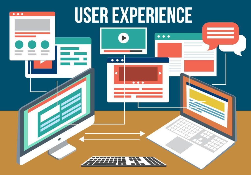
To optimize for user experience, ensure the landing page is user-friendly, aesthetically pleasing, and mobile-friendly. By focusing on these aspects, a landing page can effectively engage and convert visitors, ultimately resulting in more leads and customers for your SaaS company.
Showcasing Benefits and Features
To effectively showcase the benefits and features of a SaaS product on a landing page, it’s important to prominently display them to emphasize the product’s value and stimulate conversions. For instance, my B2B SaaS product Shorts Maker gives visitors the ability to start a free trial with the product to immediately experience the value the software can provide completely risk free.

By clearly showcasing the benefits and features of a SaaS product, potential customers can better understand the product’s value and why they should choose it over other options. This clarity and emphasis on value can lead to increased conversions and ultimately, better growth for the SaaS company.
Pro Tip: Speak to ROI (return on investment) whenever you can on your landing page. If your customers are expected to get time back, save money or generate more income by leveraging your product then you should advertise it on the landing page. These are compelling factors in the decision making process for a prospect when they are searching for better solutions.
Utilizing Social Proof and Testimonials
Social proof and testimonials are essential components of B2B SaaS landing pages, as they aid in fostering trust and reliability with potential customers. They offer assurance to visitors, thus raising the probability of conversion and stimulating business growth.
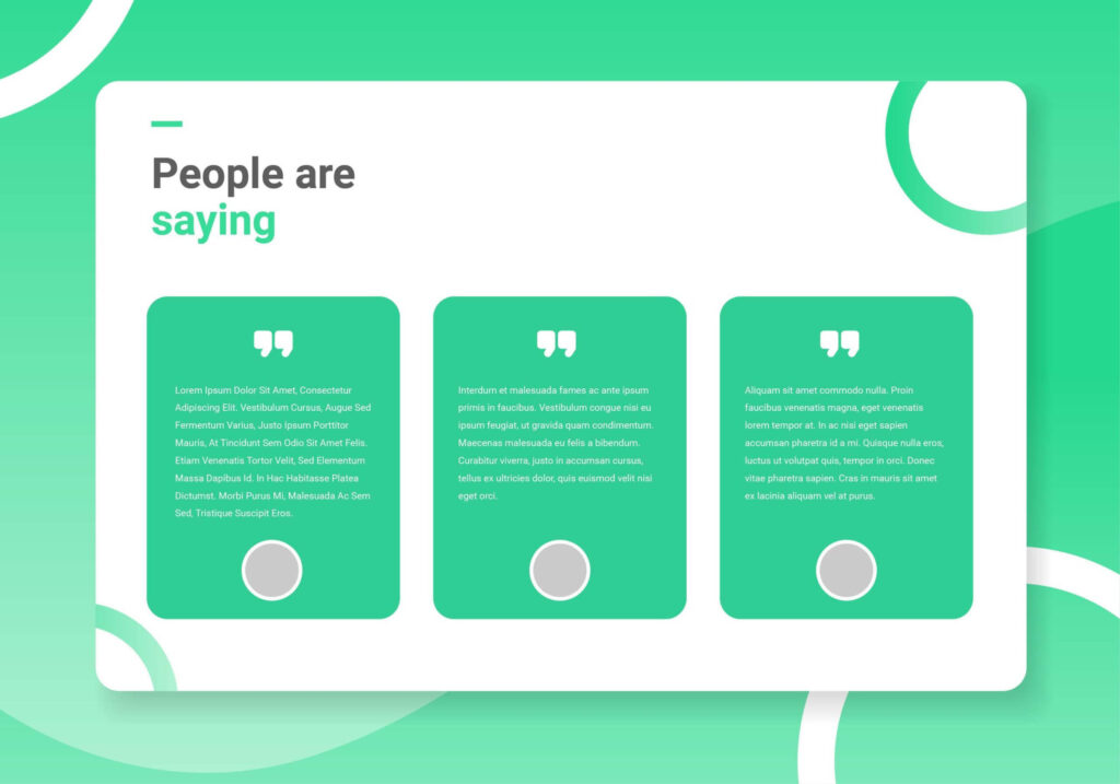
Social proof and testimonials can be effectively employed on B2B SaaS landing pages in a number of ways, such as displaying customer reviews, featuring customer logos, and highlighting customer success stories. By leveraging these trust-building elements, a landing page can effectively build credibility and persuade more visitors to convert into leads or customers.
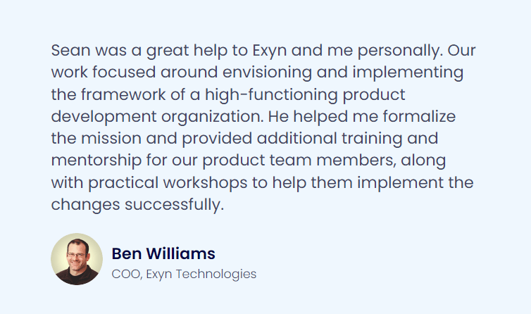
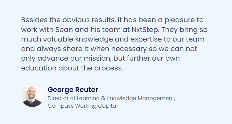
The key objective of social proof is to make your visitor understand that you have already helped people like them (personas) achieve the goal they have in mind with the help of your product (solution). I find testimonials to be a very helpful, but relatively easy to create example of effectively demonstrating social proof. Take a look at my website at nxtstep.io for some examples and I’ve also pasted a few here to give you a better idea what I mean.
High-Converting B2B SaaS Landing Page Examples
To draw inspiration from successful B2B SaaS landing pages, let’s explore examples from industry giants like Intercom, HubSpot, and Salesforce. These landing pages showcase best practices and effective design elements that can be adapted and applied to your own landing page design to increase conversions and drive growth.
For example of the landing pages that I have evaluated below, I’ve analyzed them across the following categories:
- Unique Selling Proposition (USP):
- The distinct advantage or feature that sets a product apart from its competitors
- Target Market Customer:
- The specific group of businesses that the SaaS product is designed to serve and benefit.
- Solution (How it Works):
- A detailed explanation of the product’s functionality and how it addresses specific business challenges.
- Social Proof (What Customers Have to Say):
- Testimonials, reviews, and endorsements from customers validating the product’s value and effectiveness.
- Return on Investment (ROI):
- A quantifiable measure demonstrating the monetary benefits or value gained in relation to the cost of the product.
- Call to Action (CTA):
- A prompt or directive on a website, urging visitors to take a specific action, such as signing up or downloading, to drive conversions and user engagement.
- Innovation Opportunities
- Areas I might modify or change based on the current state of their landing page to try to improve conversions and results
List of 25 B2B SaaS Companies with Great Landing Page Designs
Intercom

Unique Selling Proposition
Intercom, as a platform, typically focuses on providing exceptional customer communication tools. Their USP might highlight real-time communication, integrations, or other features that differentiate them from competitors.
Target Market Customer
Intercom is designed for businesses that need to enhance their customer communication. This could range from startups to established enterprises that require chat services, customer support tools, and other communication integrations.
How it Works
Intercom offers a suite of tools, including chatbots, live chat, and customer support ticketing. Their platform may emphasize instant communication, automation, and an integrated approach to customer service.
Social Proof
Effective landing pages often use social proof to establish trust and credibility. Without direct access to Intercom’s landing page, we can’t confirm the specific use of testimonials, but it’s common for such businesses to showcase customer stories, ratings, and logos of notable clients to build trust.
ROI (Return on Investment)
To quantify the value of their product, Intercom might highlight metrics related to increased customer satisfaction, reduced response times, or increased sales conversions. Demonstrating ROI is crucial as it helps potential clients understand the tangible benefits of using the platform.
Calls to Action (CTAs)
Intercom leverages call to action buttons that are primarily for viewing a demo or starting a free trial. I like that their ‘view demo’ button provides an actual video. Many pages try to only make these buttons really lead captures to view a demo later and I think that tactic is misleading.
Innovation Opportunities
I like the call to action buttons they are leveraging, but there probably aren’t enough of them. They are mainly at the top and not further down the page. If they added more, I think they might find that more people would convert from those other sections of the page.
HubSpot

Unique Selling Proposition
HubSpot’s Unique Selling Proposition (USP) is its comprehensive, all-in-one solution that integrates marketing, sales, and service functions under a single platform. This holistic approach allows businesses to have a cohesive and streamlined process for managing their customer relationships.
Target Market Customer
HubSpot typically targets marketing professionals, sales teams, and businesses looking to streamline and optimize their inbound marketing and sales efforts. Check for specific personas, industries, or job titles that they might mention or target in their content.
How it Works
HubSpot provides an all-in-one marketing, sales, and service software solution. They might detail out functionalities like CRM, email marketing, automation, analytics, etc. Often, they will have diagrams, workflow charts, or videos showing the software in action.
Social Proof
Many SaaS companies, including HubSpot, leverage testimonials and case studies from satisfied customers. Look for quotes, company logos, or case study snippets that provide evidence of their platform’s effectiveness.
ROI (Return on Investment)
HubSpot might present statistics, figures, or case study results that showcase the potential ROI of using their platform, such as increased leads, sales conversions, or customer retention rates. They might also have calculators or tools for businesses to estimate potential ROI.
Calls to Action (CTAs)
Hubspot heavily leverages call to action buttons for booking a demo, learning more or getting started for free. I’m a big fan of being product-led and directly as many prospects into your product as quickly as possible.
Innovation Opportunities
Not much and Hubspot is pretty good at this, but there’s a block of the various Hubspot products (2 rows, 3 columns) midway down their landing page that might be a tad overwhelming for prospects to see all at once. I might consider breaking this up a bit more so it’s easier for visitors to consumer.
Salesforce

Unique Selling Proposition
Salesforce’s USP is its all-encompassing, integrated CRM platform that provides businesses with the tools needed for sales, service, and marketing, all under one roof. It stands out for its comprehensive features and adaptability to various business needs.
Target Market Customer
Salesforce targets a broad range of customers, from small businesses to large enterprises. It is designed for companies that want to improve their customer relationship management, streamline sales processes, and enhance customer service and marketing efforts.
How it Works
Salesforce offers a cloud-based Customer Relationship Management (CRM) system. It provides modules for sales, customer service, marketing, and more, enabling businesses to manage customer interactions, track leads and sales, run marketing campaigns, and gather insights from data analytics.
Social Proof
Salesforce frequently showcases customer success stories and testimonials on its website. These stories highlight how businesses have benefited from using Salesforce’s services and the positive impacts on their operations.
ROI (Return on Investment)
Salesforce emphasizes the tangible returns businesses can achieve by using its platform. By streamlining operations, enhancing customer interactions, and providing valuable insights, Salesforce helps businesses improve their ROI. They offer resources and tools for companies to measure the return on their digital sales and marketing initiatives.
Calls to Action (CTAs)
Salesforce leverages call to action buttons for starting a free trial, watching demos and other custom actions that are unique to the various sections throughout the page. This is an improvement from the salesforce pages from years ago.
Innovation Opportunities
Their landing page is pretty solid, but I noticed they have a great simple, but effective section promoting their flagship product which is their CRM product quite a ways down the page. I would probably look to bump that up a bit higher given that is the primary product that they offer.
Apollo

Unique Selling Proposition
Apollo provides users with the “world’s most up-to-date lead database,” offering access to over 265M contacts and streamlining the sales engagement process with AI-powered tools[1].
Target Market Customer
The primary target market for Apollo comprises sales teams and businesses, particularly the “sellers at 160K+ companies” looking to efficiently connect with potential buyers and achieve their sales targets.
How it Works
Apollo functions as a comprehensive sales platform. It offers:
- A vast database for lead discovery and contact verification.
- Sales intelligence tools granting access to rich buyer data.
- AI-driven lead scoring and messaging tools.
- Integration capabilities, including a Chrome extension.
- End-to-end automation for sales processes.
- Conversation and deal intelligence to enhance sales conversations and deal closures.
- Data enrichment features to update CRM systems and provide deep market insights[1].
Social Proof
The platform showcases a rating of 4.8/5 based on 5,780 reviews, indicating strong user satisfaction. Additionally, there’s mention of over 1,000,000 people joining Apollo in the past year, and the software’s recognition as the “#1-ranked Sales Intelligence & Sales Engagement solution on G2”.
Return on Investment
While specific ROI figures aren’t provided, the software claims to result in a “50% decrease in time to meeting”, potentially indicating quicker sales cycles and increased efficiency for users.
Calls to Action (CTAs)
Apollo includes CTAs for signing up for free, requesting a demo and learning more about the product.
Innovation Opportunities
Not much because Apollo is good at this. However, I have noticed that their support is excellent. I’m sure they have rave reviews about their support and if so, I would likely make that stand out a bit more because it’s hard to stand out in their competitive space. Apollo is a great example that great support can still be a differentiator.
SEMRush
Unique Selling Proposition
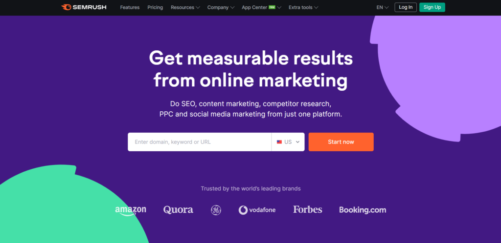
SEMRush is an online marketing tool that helps content creators and marketing teams with producing content that will perform best when it comes to SEO or search engine optimization.
Target Market Customer
They are marketing their tools at marketers and marketing teams. However, this could probably be a bit more clear or direct on their landing page.
How it Works
Right below the fold, they start showing you product-esque visuals to give you a better idea of what the product is and how it works. This includes everything from SEO research to content marketing to social media marketing.
Social Proof
Power quotes are shown below the ‘how it works’ section to reinforce the value marketers are getting from investing in SEMRush. Better yet, these quotes speak to how much better the tool is than a suite of other tools.
ROI (Return on Investment)
Return on investment is implied by their headline which is ‘Get measurable results from online marketing’. This is important because this is a common complaint from marketers having to make the case for investing in marketing. I would like to see more ROI data or metrics being shared however.
Calls to Action (CTAs)
What’s great about what they’ve done here is entice you to get started right away by asking for your domain and making the primary call to action button ‘Start now’. This implies if you enter your domain and press start you’re going to get immediate results.
Innovation Opportunities
Not much because this is one of my favorite landing pages from this group. I might consider adding pricing elements to the landing page because that may filter out anyone who would never payd what SEM charges. That would reduce their operational costs and potentially boost their conversion rate.
Ahrefs
USP (Unique Selling Proposition)
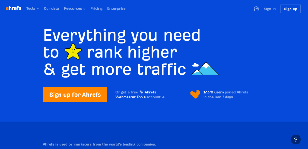
Ahrefs is a research tool leveraged by marketers from ‘the world’s leading companies’ so that they can ‘rank higher & get more traffic’. Excellent H1 (headline).
Target Market Customer
‘Marketers from the world’s leading companies’. They make this very clear and I love it.
Solution (How it Works)
Just below the fold, they get into all the powerful capabilities of their tools. This includes screenshots, links to individual pages about each tool and even a demo video you can play right away to see the tools in action yourself. This section is powerful.
Social Proof
They have a scrolling list of some of the world’s largest and most recognizable companies listed just below the hero or top section of the landing page and above the fold so that everyone can see it when they land on the page.
ROI (Return on Investment)
Ahrefs includes metrics related to how many customers choose their product over the competition, but they are light on ROI data elsewhere on the page. It is in the video to an extent, but I’d rather see this on the homepage itself to help me understand what return I may get by making the investment into their product.
Calls to Action (CTAs)
I LOVE the fact that Ahrefs has essentially a single and giant call to action button that just says ‘Sign up for Ahrefs’. This makes the next step clear and obvious for the visitor.
Innovation Opportunities
Ahrefs did what I suggested for improving the SEMRush page, which is probably their top competitor, in adding their pricing to their landing page. This is an excellent landing page. I might consider moving the social proof section higher to see how that impacts conversions.
Seamless

USP (Unique Selling Proposition)
This is made very clear and compelling from the headline on the page that Seamless will provide you with ‘The World’s Best Sales Leads’. Seamless provides a database of contact information for sales teams looking to invest in sales outreach.
Target Market Customer
The page heavily utilizes language related to sales, prospects and teams. The page is written in a style that is speaking directly to a sales professional. It’s very obvious, but not specifically called out.
Solution (How it Works)
As you move down the page, Individual sections are dedicated to functionality in the software. This gives prospects the ability to review each individually to better understand what they do, how they work and the value they provide.
Social Proof
I really like the way they leverage social proof. They have many quotes but they are placed on different sections of the page as you work your way down. Better yet, the quotes provided are specifically about which part of the product they are marketing on that section of the page.
ROI (Return on Investment)
With language like ‘Prospect Less, Close More’ on the page they are indicating that you will save time and generate better results by investing in their software. Further down the page, they display strong ROI data related to crushing quotas, full pipelines and tons of booked appointments.
Calls to Action (CTAs)
Seamless leverages different variations on similar call to action buttons down the page. Many are styled after getting started. Some mention for free and others speak to a specific section to allow prospects to choose to get started with that product feature immediately.
Innovation Opportunities
The hero section is probably too busy. Lots of call to action buttons and input options here which is potentially overwhelming and could be confusing their prospects.
ActiveCampaign
USP (Unique Selling Proposition)
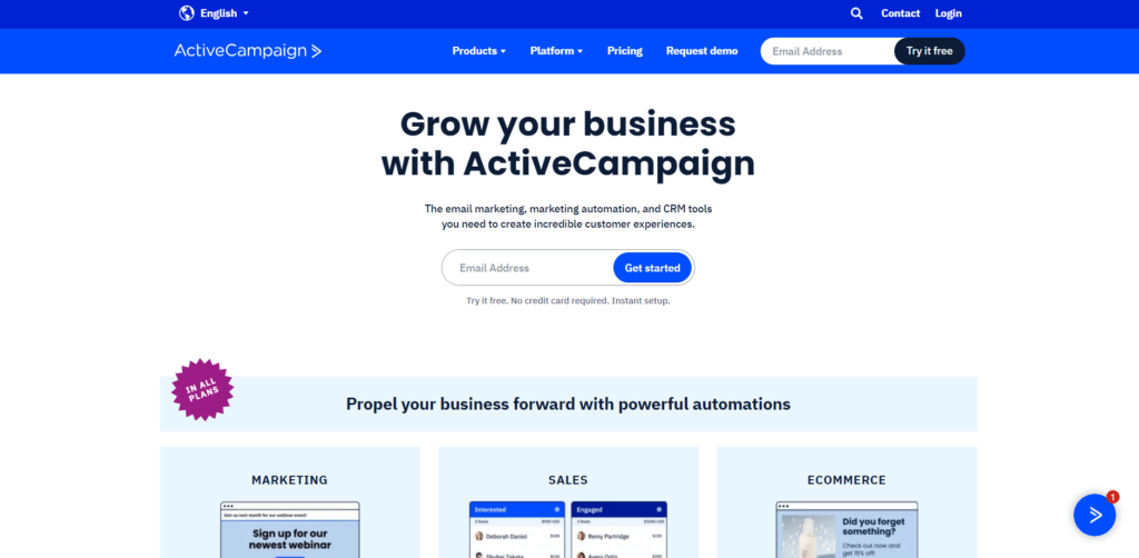
ActiveCampaign offers email marketing tools for the purpose of growing your business.
Target Market Customer
There isn’t a ton of context on the ActiveCampaign page to speak specifically or directly to any individual personas, but the language they use on the page heavily implies sales and marketing professionals and teams.
Solution (How it Works)
They don’t have an explicitly ‘how it works’ section dedicated on the page, but partially below the fold they advertise three separate components of functionality related to marketing, sales and ecommerce. They also include a call to action button to learn more about each.
Social Proof
Further down on the page they have a section called ‘customer stories’ with quotes from team members at specific companies that have found value with their software plus a call to action button to ‘watch’ each story in video format.
ROI (Return on Investment)
The ROI strategy ActiveCampaign is leveraging on their page is research backed. They’ve selected specific statistics from industry research related to the value their software provides to provide context for the ROI customers could receive if they invest in their product. Here are a few examples:
- “Automation helps 95% of businesses achieve what they couldn’t on their own.”
- “Contact list sizes increase 143% with personalized email marketing.”
- “Sales automation increases qualified leads 110% on average year-over-year.”
Calls to Action (CTAs)
ActiveCampaign has chosen to create lots of different variations of CTA buttons throughout the page. Most are customized to the section in which they fall. This strategy can be effective because it creates a more customized experience for visitors that are looking for answers to specific questions.
Innovation Opportunities
The text is probably too small while browsing from a desktop or laptop. Readers with eyesight issues may have trouble consuming the information.
The footer is a bit much. Two sections back to back have dozens of links in small text. It’s overwhelming and is likely to confuse visitors.
I’d probably try to make the page feel less cluttered and busy. There’s a lot going on that can probably be simplified quite a bit for a simpler user experience.
Mailchimp

USP (Unique Selling Proposition)
Mailchimp offers an email marketing and automation platform that they market on their landing page as focused on helping companies ‘grow their revenue’. At the moment, they’ve chosen to have their landing page promote an upcoming virtual conference.
Target Market Customer
The Mailchimp landing page doesn’t specifically call attention to any individual buyer persona. What is implied throughout the page is that their tool is built for marketers and marketing teams since it primarily focused on email marketing and automation.
Solution (How it Works)
Partially exposed just under the fold is a grid design showcasing various functionality available through their software. Here they are promoting their advanced functionality related mainly to automation and AI. They also list individual customized call to action buttons where one can go to learn more about each advertised functionality.
Social Proof
Mailchimp doesn’t currently have much in the way of social proof on their landing page. Anything that might qualify for this category is strictly marketing or research based.
ROI (Return on Investment)
Mailchimp shares statistics related to delivering outcomes for customers based on the functionality their software provides. Here are some examples:
- “Generate up to 4x more orders* with Customer Journey Builder automations”
- “Get up to 88% more revenue* with our Customer Lifetime Value and Likelihood to Purchase segments”
Calls to Action (CTAs)
Mailchimp has many CTA buttons throughout their landing that promote unique experiences and even display as different design formats. They have buttons for everything from registering for their virtual conference to learning more about specific features to pricing. The designs show up as a typical button and others as links to ‘Learn more’.
Innovation Opportunities
I’d like to see Mailchimp add more social proof to the landing page as well as decrease the variety of call to action buttons. I’d like to review the results from split testing with a fewer number of choices.
Shopify
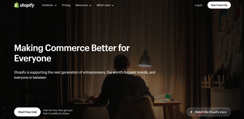
USP (Unique Selling Proposition)
Shopify is a website builder for eCommerce companies. They aim to make it easier for companies to sell their products online.
Target Market Customer
Shopify leans heavily into the category of entrepreneurs and specifically those who run eCommerce businesses.
Solution (How it Works)
Halfway down the Shopify landing page you’ll find a Gif of how their eCommerce website builder tool works. I love the use of Gifs in this case because the animations (usually short videos) play automatically and continuously loop so there’s nothing for the user to do they are able to see everything automatically.
Social Proof
Shopify leverages autoplay style videos further down their landing page which demonstrate specific use cases for some of their most successful customers. Under that, you’ll find a scrolling marquee style list of quotes that highlight the success their customers have had leveraging their software.
ROI (Return on Investment)
Shopify does a great job of incorporating the ROI into the social proof from their customers. The testimonials provided speak to the successful outcomes their customers have been able to achieve by leveraging their software.
Calls to Action (CTAs)
Shopfiy leverages various styles and types of call to action buttons throughout their landing page. They do a great job of making each CTA a specific action that a prospective customer may wish to take.
Innovation Opportunities
Not much, their landing page is pretty solid. It is however quite long so I might check the analytics to see how many folks actually make their way down the entire page. If that data isn’t great, I’d probably look to condense it some to make sure prospects are hitting all of the important categories.
Monday

USP (Unique Selling Proposition)
Monday provides collaboration and productivity tools for teams to work together more effectively.
Target Market Customer
Their landing page specifically states that their tools are ‘for everyone’ which is a tough argument to make, but may technically be true. However, throughout the page much of their testimonials seem to come from folks that have ‘product’ or ‘innovation’ in their title.
Solution (How it Works)
Monday has specific tools listed in interactive components in the hero section of their landing page which is relatively unique for this list. It’s a bold move, but I think it works. Why not get right into it?
Social Proof
Monday has a specific section of the landing page dedicated to testimonials complete with headshots, titles and company names.
ROI (Return on Investment)
Separately from the social proof section, Monday has a dedicated area to ROI which I love and is also surprisingly relatively unique for this list. Here are some of the statistics shared related to ROI:
- 80% of goals achieved with OKRs on monday.com
- 74% improvement in customer retention
These speak to the wide range of possibilities for software from Monday to make a positive impact for their customers. Better yet, these metrics are tied directly to specific customers and video testimonials to further describe the case study in detail. Very well done.
Calls to Action (CTAs)
Most call to action buttons throughout the page are the same style which is a personal preference of mine. The majority of them are labeled ‘Get Started’ which is another strategy I prefer because I feel it improves the usability of the landing page.
Innovation Opportunities
I don’t like to say any product is ‘for everyone’ because they rarely (if ever) should be. I’d like to see them be more opinionated about who their tools are for (and who they are not). Besides that, the landing page is solid especially for a B2B SaaS company with widely applicable products which makes this that much harder to do well.
By analyzing and drawing inspiration from these examples, you can create your own high-converting B2B SaaS landing pages that drive growth and success.
If you’d like to improve or build an effective landing page for your B2B SaaS product company, schedule a free product strategy session with me so I can learn more about your goals and how I can help.
Common Mistakes to Avoid with B2B SaaS Landing Pages
While crafting B2B SaaS landing pages, it’s necessary to recognize common pitfalls that could compromise their effectiveness. Some of these mistakes include overloading them with too much information, ignoring mobile responsiveness, and neglecting A/B testing. By avoiding these pitfalls, you can increase the chances of creating a high-converting landing page that effectively engages and converts visitors.
Addressing these common mistakes not only improves the overall design and functionality of the landing page but also improves the user experience and conversion rates. By keeping these potential issues in mind, you can create a more effective landing page that will drive growth and success for your SaaS company, ensuring a smooth slack landing for your visitors.
Pro Tip: Make sure you don’t strike a poor balance between wording and visuals on your landing pages. Something that is too heavily worded will be overwhelming for your visitors which may cause them to quit the page before they determine whether or not they may need your product. A leading indicator that you’ve fallen into this trap is a very large percentage of short sessions on your landing pages. Leverage analytics tools like Google Analytics and Hotjar to evaluate this.
Overloading with Information
Flooding a landing page with excessive information can impede its effectiveness, potentially causing visitors to feel overwhelmed and have difficulty locating crucial information. To prevent information overload, it’s important to prioritize the most important advantages and characteristics, utilize visuals to communicate information, and employ succinct and easy to understand language.
By focusing on the essential information and presenting it in a clear and concise manner, you can create a more effective landing page that engages visitors and encourages them to take action. By avoiding information overload, you can improve the overall user experience and increase the chances of converting visitors into leads or customers.
Ignoring Mobile Responsiveness
Given the modern digital landscape, guaranteeing mobile-responsiveness of your landing page is of utmost importance. Neglecting mobile responsiveness can result in a subpar user experience, likely resulting in a decrease in conversions and an increase in bounce rate.

To ensure mobile responsiveness, it’s important to design the landing page with mobile devices in mind, utilize a responsive design framework, and test the page on multiple devices. By prioritizing mobile responsiveness, you can create a seamless experience for users on all devices and improve the overall effectiveness of your landing page.
Neglecting A/B Testing
Conducting regular A/B testing becomes pivotal for optimizing your landing page to maximize conversions. A/B testing involves creating two versions of a landing page and comparing their performance, allowing you to determine which elements are most effective for driving conversions.
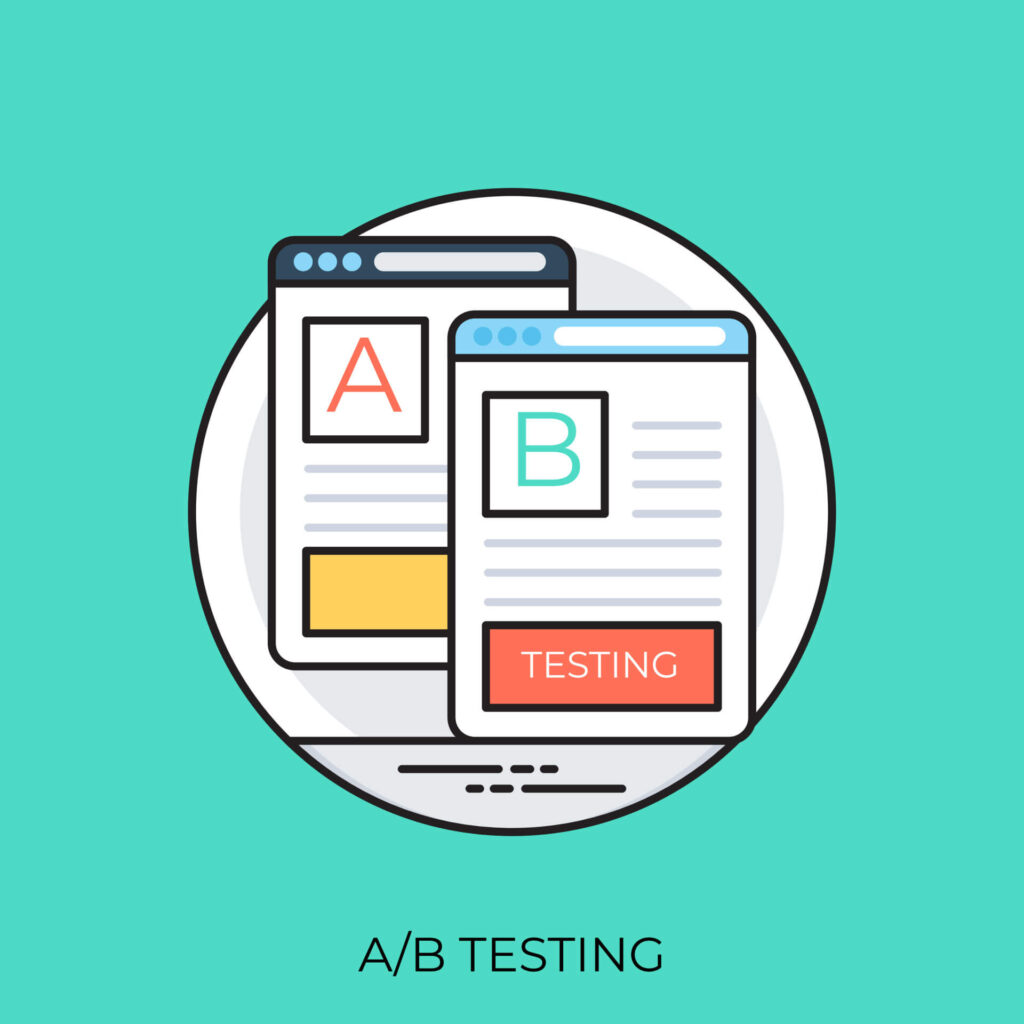
By neglecting A/B testing, you run the risk of missing out on potential improvements and optimizations that can increase your landing page’s effectiveness. Consistent testing and analysis can lead to:
- Better user experiences
- More valuable data tracking and analysis
- Higher conversion rates
- Business growth
B2B SaaS Landing Page Design Strategy
B2B SaaS landing page templates can provide a constructive kick-off point for devising high-converting landing pages. These pre-made webpages can be tailored to your specific needs and preferences, allowing you to quickly and easily create landing pages that drive growth and success.
In this section, we’ll explore three popular templates, including minimalist design, social proof heavy, and interactive experience templates.
Design 1: Minimalist Design
The Minimalist Design template focuses on simplicity and clarity, with a clean layout and strong call-to-action. This template emphasizes the key advantages and characteristics of your SaaS product, making it easy for visitors to understand its value and take action.
Adopting a minimalist design allows you to:
- Establish a visually pleasing, user-friendly landing page
- Efficiently convey your product’s value to potential customers
- Create a clean, simple, and effective landing page that drives conversions
This template is an excellent choice for those looking to achieve these goals. It’s also a great place to start. I wouldn’t recommend investing heavily into designing a landing page until you know it’s successfully converting based on the fundamental elements.
Design 2: Social Proof Heavy
The Social Proof Heavy template emphasizes trust-building elements like testimonials, case studies, and client logos. Embedding these elements into your landing page can help foster credibility and trust among potential customers, thereby improving conversions.
This template is an excellent option for businesses looking to showcase the reliability of their product and services through the use of social proof. By leveraging testimonials, case studies, and client logos, you can effectively demonstrate to potential customers that your product is trusted and used by others, leading to increased conversions and business growth.
Leveraging a social proof heavy design is effective because it helps your prospects understand how you’ve already helped people like them. This builds trust and increases the probability that they will be motivated to learn more about your product.
Design 3: Interactive Experience
The Interactive Experience template engages visitors with interactive elements like quizzes, calculators, or chatbots to encourage conversions. These interactive components can provide an engaging and immersive experience for users, helping to keep them engaged and increasing the chances of conversion.
Integrating interactive elements into your landing page can yield a more engaging and unforgettable experience for visitors, culminating in superior conversion rates and user satisfaction. This template is an excellent choice for businesses looking to create a unique and interactive landing page that drives growth and success.
The key to leveraging this design successfully is ensuring that the interactive elements you’ve added are being used and providing value to prospects. Use analytics to measure the effectiveness of these elements.
Summary
In conclusion, creating high-converting B2B SaaS landing pages is essential for the growth and success of SaaS companies. By focusing on user experience, showcasing benefits and features, and utilizing social proof and testimonials, you can create an effective landing page that drives conversions. Additionally, drawing inspiration from successful examples like Intercom, HubSpot, and Salesforce, plus avoiding common mistakes like overloading with information, ignoring mobile responsiveness, and neglecting A/B testing can lead to even greater success.
By following the strategies, examples, and templates presented in this blog post, you can create your own high-converting B2B SaaS landing pages that will drive growth and success for your business. Now, it’s time to take action and start creating your own high-converting landing pages.
If you need any help creating effective landing pages for your SaaS product or business, schedule a free product strategy session with me so I can learn more about how I can best help you.
Frequently Asked Questions
What should be on a SaaS landing page?
A SaaS landing page should include a hero section, features/benefits, social proof, contact form, demo video, and call-to-action to effectively engage the user.
How do I create a B2B landing page?
Create a B2B landing page with one clear call-to-action, strong copy, engaging visuals, listed benefits and features, social proof, and journey awareness. Ditch the top navigation to keep visitors focused on the reason for visiting the page.
What is a landing page for a B2B product?
A B2B landing page is a standalone web page created for a single marketing or advertising campaign – it’s where potential customers land after clicking on one of your ads, emails, or social media posts.
What are the key components of a high-converting B2B SaaS landing page?
Key components of a high-converting B2B SaaS landing page are a clear value proposition, engaging visuals, a strong call-to-action, and social proof to build trust.
What are some examples of high-converting B2B SaaS landing pages?
Intercom, HubSpot, and Salesforce are examples of high-converting B2B SaaS landing pages.

